
Machinery Partner is a digital marketplace for buying, financing, and servicing heavy equipment — serving construction, agriculture, and recycling businesses across 40+ U.S. states. The company raised $11M in Series A funding.
I joined in 2022 as a Senior Product Designer and grew into the role of Design Technologist. Since 2023, I’ve been the sole designer — owning product design, the design system, and frontend code. Almost everything you see on the platform, I designed and most of it I built.
My Role
Product design, design system architecture (Figma + code), UI engineering, website design and development, AI feature design, prototyping, user flows, frontend implementation in Next.js and React Native.
Where It Started
When I joined, the product was built on Webflow and the team was small. There was no design system, no component library, no consistent visual language. Every new page or feature was designed from scratch, and the gap between what was designed and what got built was wide. The business was growing fast — expanding across states, adding financing options, onboarding enterprise buyers — and the platform couldn’t keep up.
My job was to fix that. Not just the design, but the entire pipeline from design to production code.
The Hard Problems
Complexity without confusion. Heavy equipment transactions aren’t simple. A buyer might be comparing three machines across different specs, calculating ROI, exploring financing options, and requesting quotes — all in one session. The interface needed to handle that depth without overwhelming people who just want to find the right machine and move on.
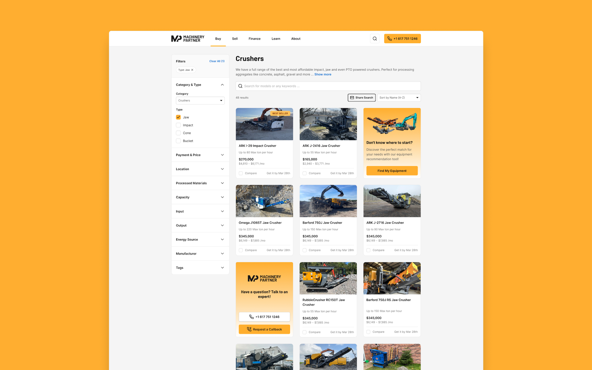
Webflow had hit its ceiling. The original site was built in Webflow, which worked early on but couldn’t support the dynamic features the product needed — real-time comparisons, complex filtering, integrated financing tools, CMS-driven inventory at scale. We needed to move to a proper frontend stack without losing momentum or breaking what was already working.
No design infrastructure. When you’re the only designer and the company is shipping fast, you can either design every screen by hand or build a system. I chose the system. But that meant creating the design system and the codebase for it simultaneously — in Figma and in Next.js — while also shipping features.
Diverse users, one interface. The platform serves individual contractors looking for a single excavator and enterprise procurement teams managing fleets. The same product pages, the same checkout flow, the same financing tools need to work for both without feeling dumbed down or overcomplicated.
What I Built
The Design System
This was the foundation for everything else. I architected the design system from the ground up — first in Figma with a token-based approach, then mirrored in code with Next.js and documented in Storybook. The system covers everything from primitive tokens (color, spacing, typography) to complex composite components (product cards, comparison tables, financing calculators).
I pioneered token-based styling in Figma early on, which reduced design-to-dev rework by 50% and made it possible for engineering to build new features without waiting on me for every layout decision. The system reached 60%+ adoption ahead of the timeline I set, and it cut UI inconsistencies and defects by 60% through component governance, documentation, and embedded WCAG 2.1 AA accessibility checks.
This wasn’t a side project — it was the strategic bet that made everything else possible.
The Website Migration
I led the migration from Webflow to Next.js. This wasn’t a redesign — it was a re-architecture. I owned both the design and the frontend implementation, using Webflow’s DevLink during the transition to ensure nothing broke while we moved to the new stack. The result was a platform that could actually support what the business needed: dynamic product catalogs, server-side rendering for SEO, integrated CMS, and the component library powering every page.
Product Design & Features
I designed and developed the core product experiences:
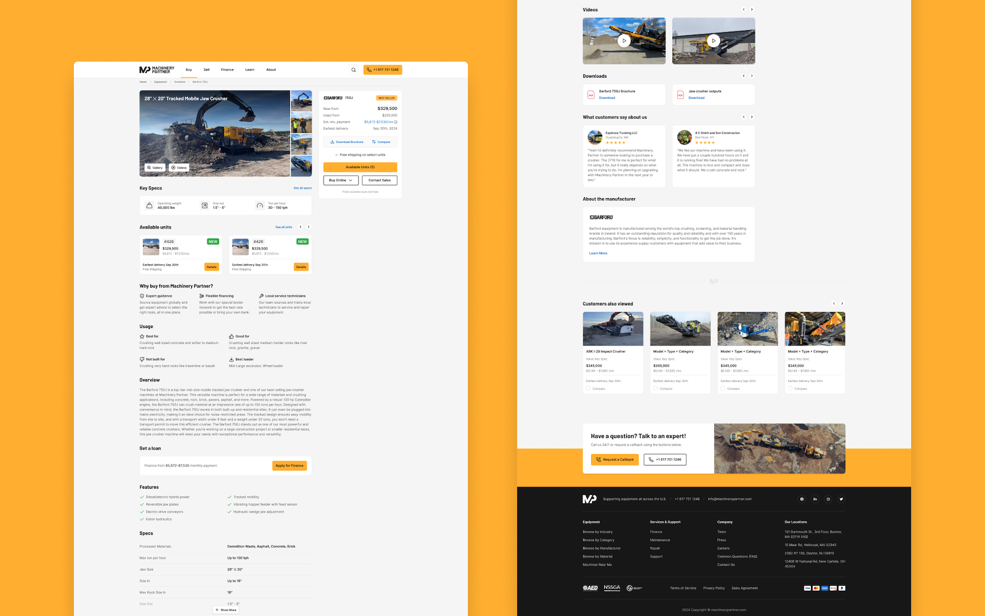
Product detail pages — dense with information (specs, pricing, financing options, trust signals, comparison tools) but structured so buyers can scan what they need without drowning in data. I redesigned these with dynamic intake forms that drove a 215% increase in CTA engagement.
Equipment comparison tools — a buyer comparing a CAT 320 to a Komatsu PC210 needs to see specs side by side, quickly. I designed the comparison flow and built the frontend for it.
Financing and ROI calculators — interactive tools that let buyers model different financing scenarios. These turned a complex, offline process into something a buyer could explore on their own before talking to sales.
Category and search experiences — filtering and navigation for an inventory that spans dozens of equipment categories, hundreds of manufacturers, and thousands of individual machines. Getting the information architecture right here was critical.
The Inspection App
I designed the UX for an industry-first heavy equipment inspection application — a mobile platform that replaced paper-based inspection processes with AI-driven image recognition and full offline functionality, so field agents could complete inspections without cell service. After designing it, I refactored the entire UI in React Native.
AI & Automation
More recently, I’ve been working on AI-powered features. I engineered advanced call-analysis prompts that automatically extract intents, objections, and next actions from sales and support calls — reducing manual note-taking by 60%. Right now, I’m collaborating with an engineer on an AI agent project using the Mastra Framework, building the company’s own RAG-powered assistant for internal operations.
Impact
- 215% increase in CTA engagement after redesigning product pages with dynamic intake forms
- 60%+ design system adoption ahead of schedule — single source of truth across all UI
- 60% reduction in UI defects through component governance and accessibility checks
- 50% less design-to-dev rework after introducing token-based styling
- 60% reduction in manual note-taking for sales and support through AI call analysis
- Expanded platform presence across 40+ U.S. states
What I Learned
This project taught me what it means to be the only designer at a company that’s scaling fast. You can’t design everything by hand — you have to build systems that let the team move without you being the bottleneck. You have to be comfortable writing code, not just handing off specs. And you have to pick the right battles: sometimes the most impactful design work isn’t a new feature, it’s the component library that makes the next fifty features possible.
Machinery Partner is where I became a Design Technologist — not because someone gave me the title, but because the work demanded it.